Design Help
Working with Images in the Design Tool
Personalizing your designs with your own images is a great way to make them truly unique. The Design Tool provides a range of features to customize your images, such as resizing, cropping, and masking. This step-by-step guide will walk you through how to use these options.
Introduction:
General Information
The Design Tool is available on desktop browsers and mobile browsers. For the best experience and efficiency, we recommend using the desktop version.
1. How to Access the Design Tool:
After clicking on the button CREATE located on every product in this store, click the “Personalize this Design” button, then click “Edit using Design Tool”.
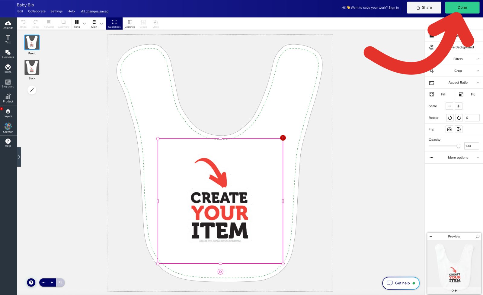
2. How to exit the Design Tool:
When you are finished with your design, click the “Done” button on the upper right hand corner to return to the product page.
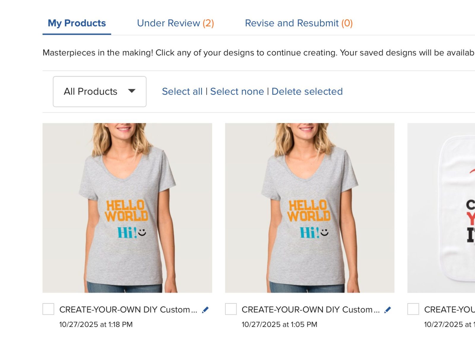
3. Saving your design:
If you are logged in, any changes you make to your design will be saved to your account under “Saved Designs”. Otherwise, your design will still be there when you go back to your URL on the same browser.
Design Tool interface explained:
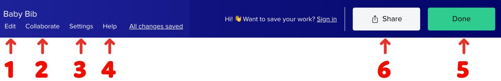
Top bar
The top bar provides quick access to key actions and settings. It includes options to edit, collaborate, access settings, and save changes.
It also has the Share and Done buttons for sharing your design or exiting the tool.
1. Edit:
Here you will find common commands like Copy, Paste, Select all, and etc.
2. Collaboration:
Create a link that you can share with other people to collaborate on the same design.
3. Settings:
Here you will find additional settings that you can toggle if you wish for a different design tool experience and appearance.
4. Help:
Quickly access more information that can help you use the design tool, with links to keyboard shortcuts, guideline info, and the Help Center.
5. Done:
Clicking this button exits the Design Tool.
6. Share:
This creates a link that you can share with other people to collaborate on the same design.
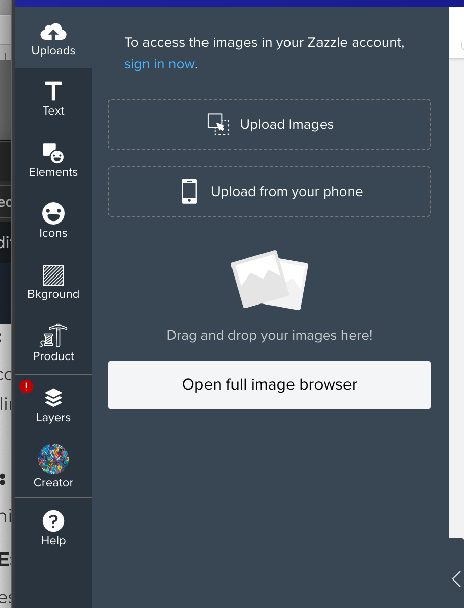
Left Tool Bar
The left toolbar in the Design Tool provides quick access to essential design features such as adding images, text, shapes, and adjusting layers for precise customization.
It serves as the starting point for creating and editing design components.
1. Uploads:
This allows you to upload your own images. You can also easily upload photos from your phone by clicking the “Upload from your Phone” button and following the instructions on-screen.
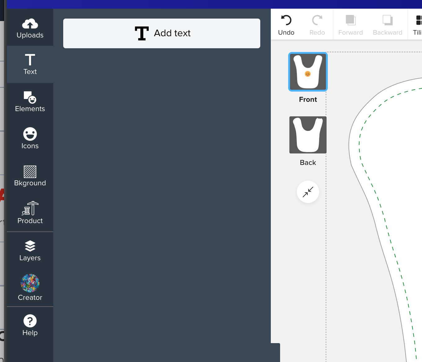
2. Text:
This feature allows you to add custom text to your design. Later on, you can adjust fonts, sizes, colors, and alignment for more personalization.
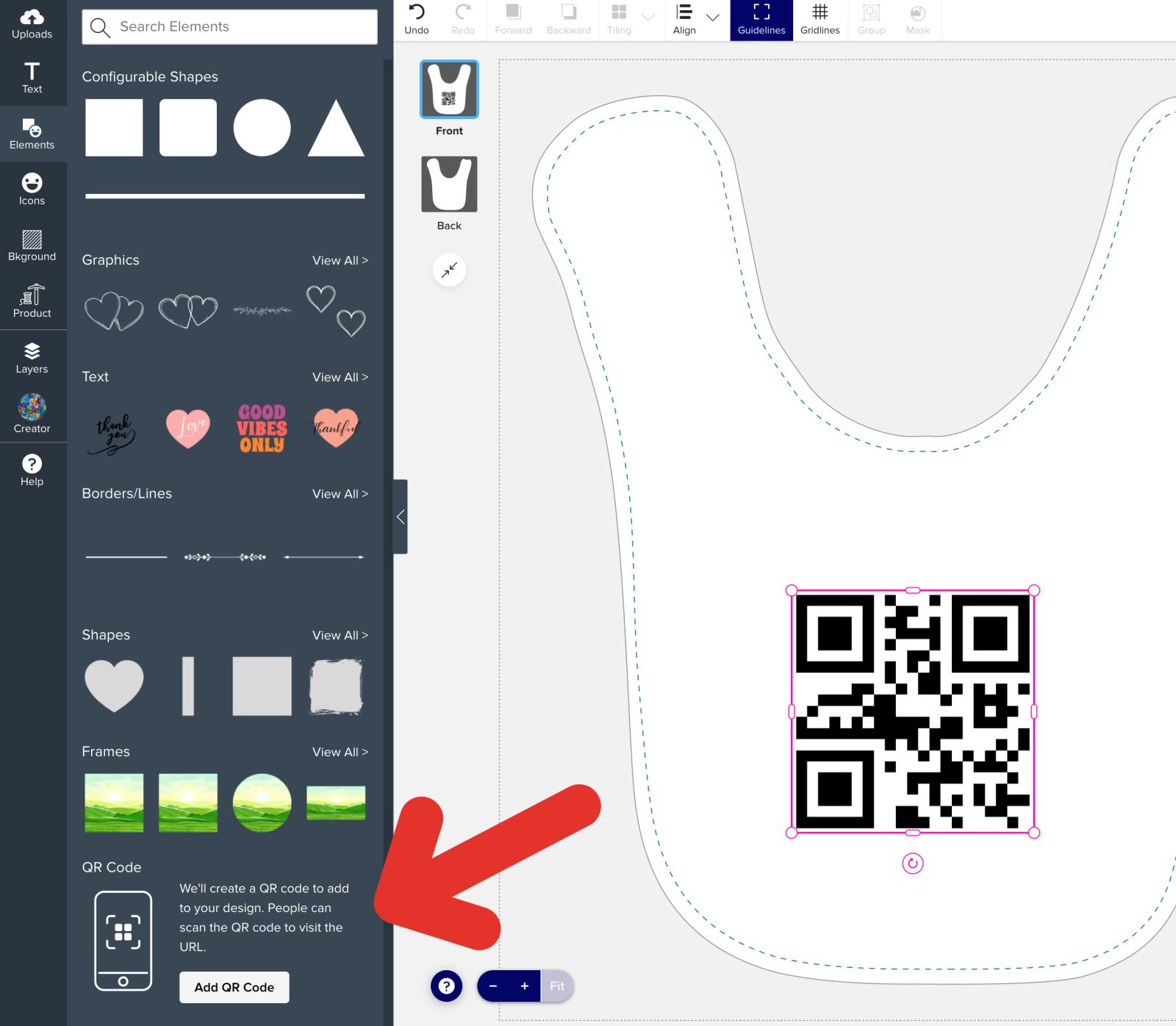
3. Elements:
This is where you can add various shapes or generate a QR code. To generate a QR code, click on the “Add a QR Code” button, and input your URL in the dialogue.
4. Icons:
This is where you can choose from our available icons and add them to your design.
5. Background:
This is where you can set a background for your design. You can upload your own image, choose a color, or choose one of our provided backgrounds.
6. Product:
Here, you can see additional information about the product you are viewing such as the product description, size, dimensions, material, and more.
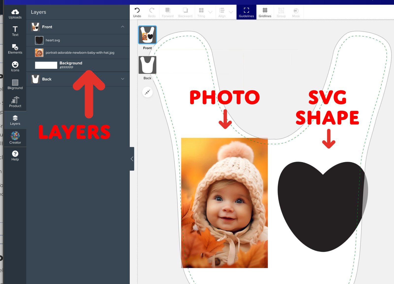
7. Layers:
This tab is where you can change the design area view e.g. “Front” or “Back” if you wish to design on the different sides of the design. You can also access and manage the individual layers of the design for precise editing.
8. Help:
Here, you can find keyboard shortcuts to make your workflow more efficient. This is also a place to learn more about the guidelines- Bleed (red), visible (blue), and safe (green) lines.
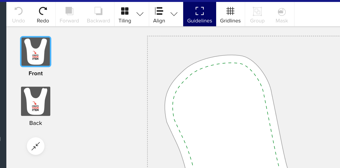
Design Canvas
The canvas is your main workspace where the design is created and visualized.
This is where you place, arrange, and edit all elements to build your product design. It displays real-time adjustments and previews.
Design Area Label:
Located on the upper left corner of the design canvas, this label tells you what design area you are in, e.g. “Front” or “Back”.
Clicking on this opens up the Layers panel, where you can switch design areas if needed.
Top toolbar:
This is where you will find common actions that can be performed on design objects.
- Undo, Redo: This allows you to quickly reverse or reapply actions in your design process for efficient editing. For even faster workflow, use keyboard shortcuts (Ctrl+Z/Command+Z for Undo, Ctrl+Y/Command+Shift+Z for Redo).
- Forward, Backward: This adjusts the position of an object within the design, moving it forward or backward in the layer order to determine how it overlaps or interacts with other elements.
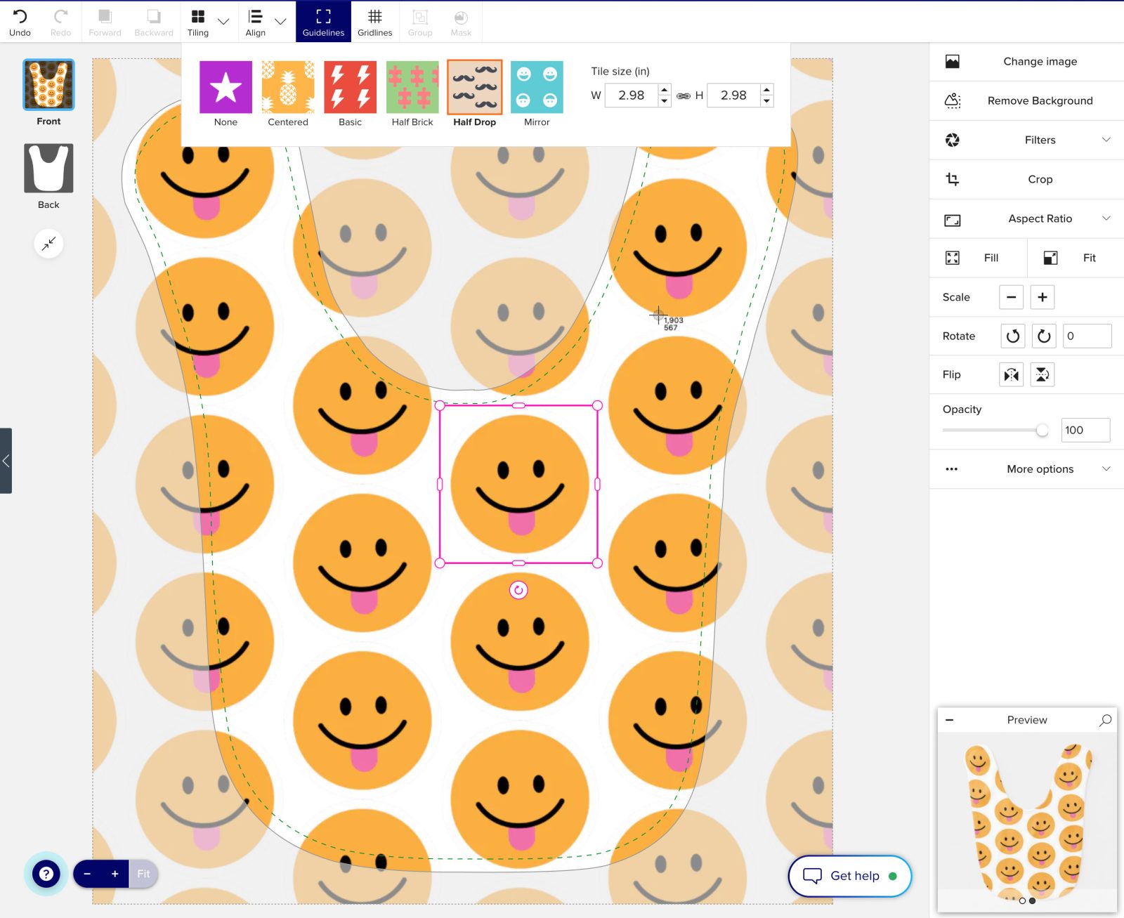
- Tiling: Tiling repeats a design or pattern across the canvas, creating a seamless and consistent look for backgrounds, textures, or repeated elements.
- Align: Use alignment tools to position objects precisely or distribute them evenly for a balanced design.
- Guidelines: This toggles displaying the gridlines on or off. Gridlines are visual guides on the design canvas that help you align and position elements with precision, ensuring a balanced and professional layout.
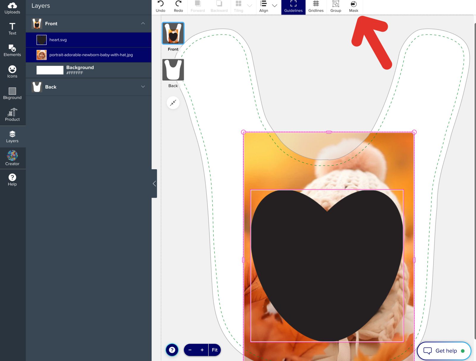
- Group: Grouping allows you to combine multiple design elements into a single unit, making it easier to move, resize, or edit them simultaneously while maintaining their relative positioning. This button is enabled when 2 or more design objects are selected.
- Mask: Object masking allows you to hide or reveal parts of an object or image by applying a mask, enabling you to create unique shapes, crop elements, or blend layers seamlessly within your design. This button is enabled when 1 SVG and at least 1 image are selected.
- Design area– this is where you will be taking actions to manipulate objects, etc
- Legend– this is an interactive legend that gives you more information about the different guidelines
- Zoom tool: located at the bottom left side of the design canvas, beside the legend. Use this to zoom in and out of your design, it is helpful when designing details
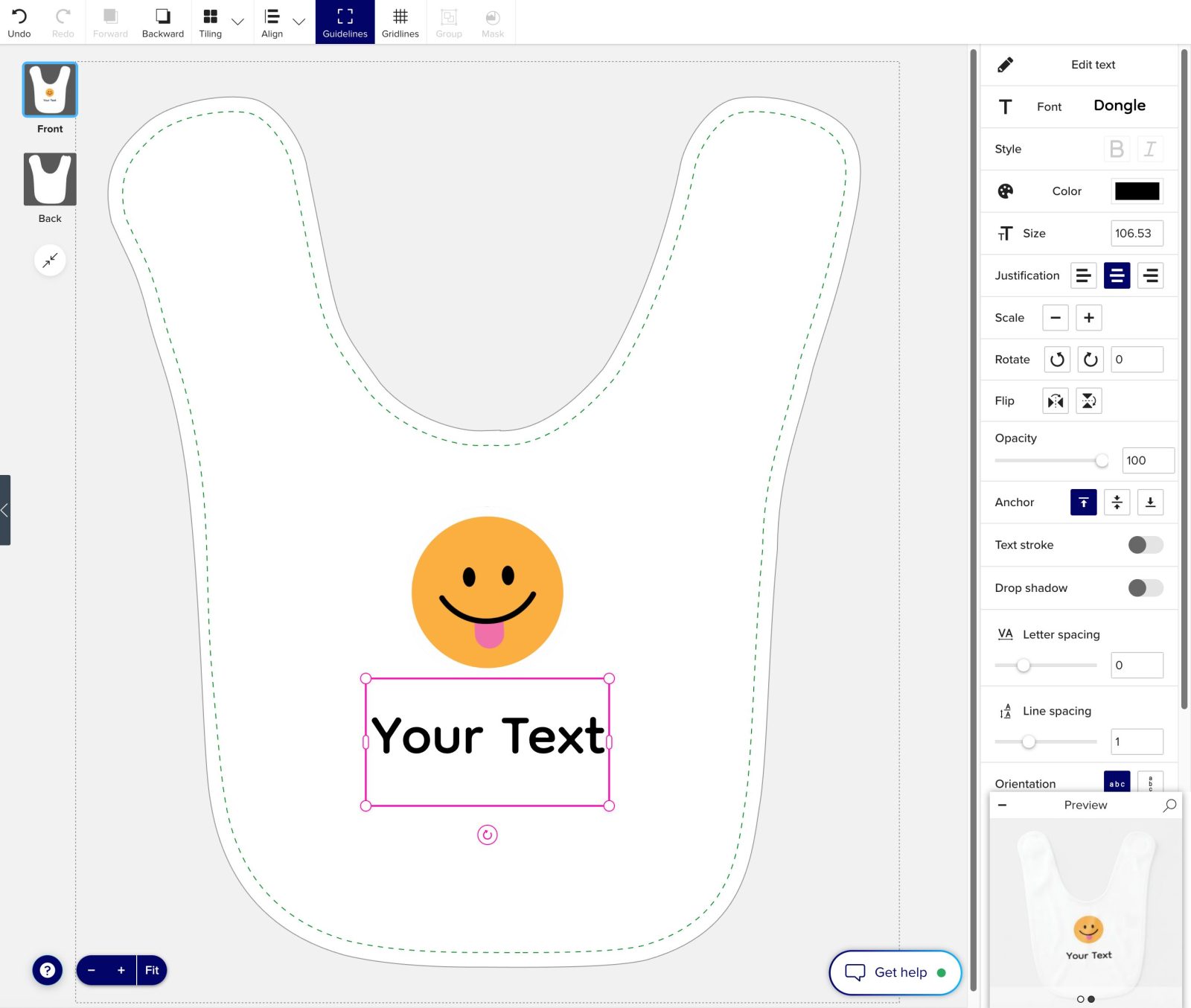
Properties Panel
The properties panel is positioned on the right side of the screen and displays all available options and editable settings for the selected object.
It enables you to customize various attributes like size, color, alignment, and more, depending on the type of element you are working with.
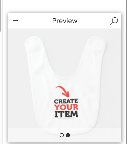
Preview window
Situated in the bottom-right corner of the screen, this box provides a quick preview of how your design will look on the product.
Use the arrows to browse through different image views.
To minimize the preview, click the “-” button in the upper-left corner.
Uploading your own image
Upload any picture, logo, or design of your own from your computer, tablet, or mobile phone. There’s no limit on how many pictures or images you can use on your layout, and you can also add as much text as you want to it.
Below are the steps to upload your own images.
1. Locate the Left Toolbar on the design interface.
2. Click on the Uploads icon to open the upload options.
3. Choose Your Source:
-
- Upload from Device/Computer:
Click the “Upload from your Device” button to select images from your computer. - Upload from Phone:
Click the “Upload from your Phone” button and follow the on-screen instructions to transfer photos from your mobile device.
- Upload from Device/Computer:
4. Your uploaded images will appear right in the Uploads tab, ready to be added to your design.
5. To add an uploaded image, simply click on it and it will be added to the design.

Image editing basis
This section outlines the essential steps for editing and managing images, providing all the necessary tools to realize your vision.
Important:
Before making any edits, ensure your image is selected by clicking on it.
Below are instructions for some common actions you may want to perform:
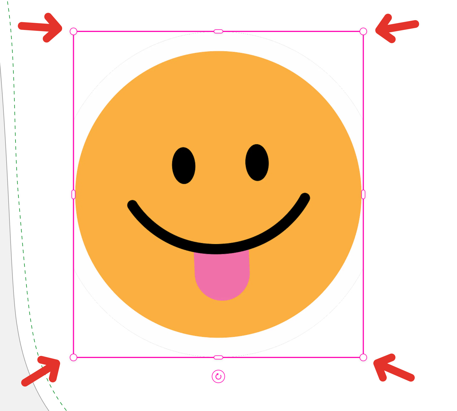
Resizing Images:
1. Select your image by clicking on it in the design canvas.
2. Click and drag any of the four corner handles (red circle) to adjust the image size proportionally, keeping the aspect ratio.
3. Click and drag the side handles for non-proportional resizing.
4. Hold the Shift key for to toggle the aspect ratio lock.
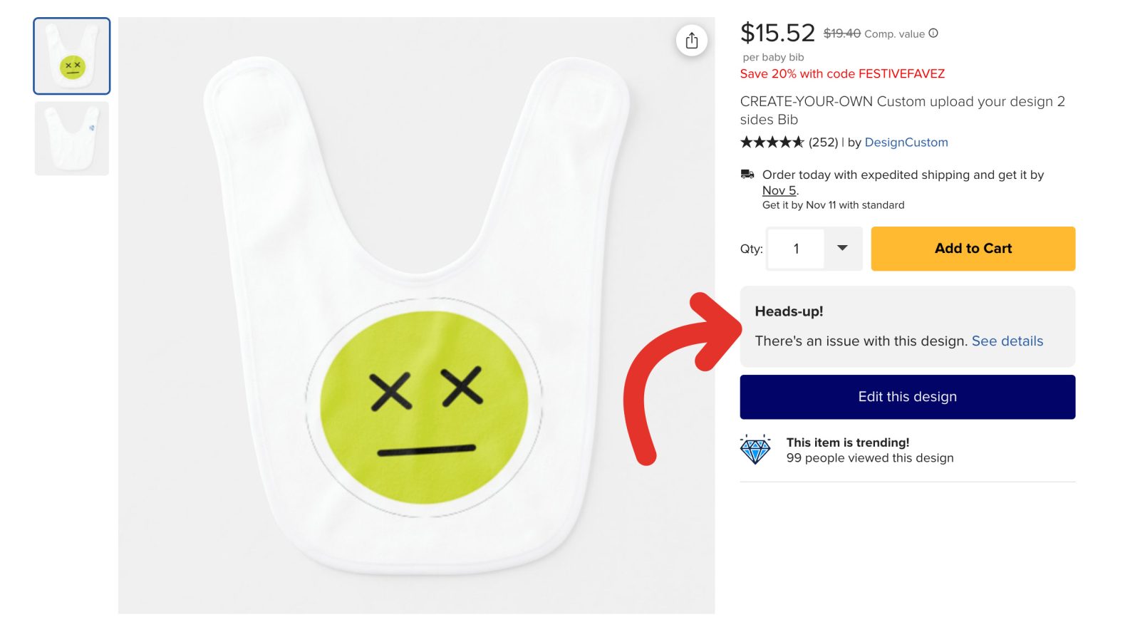
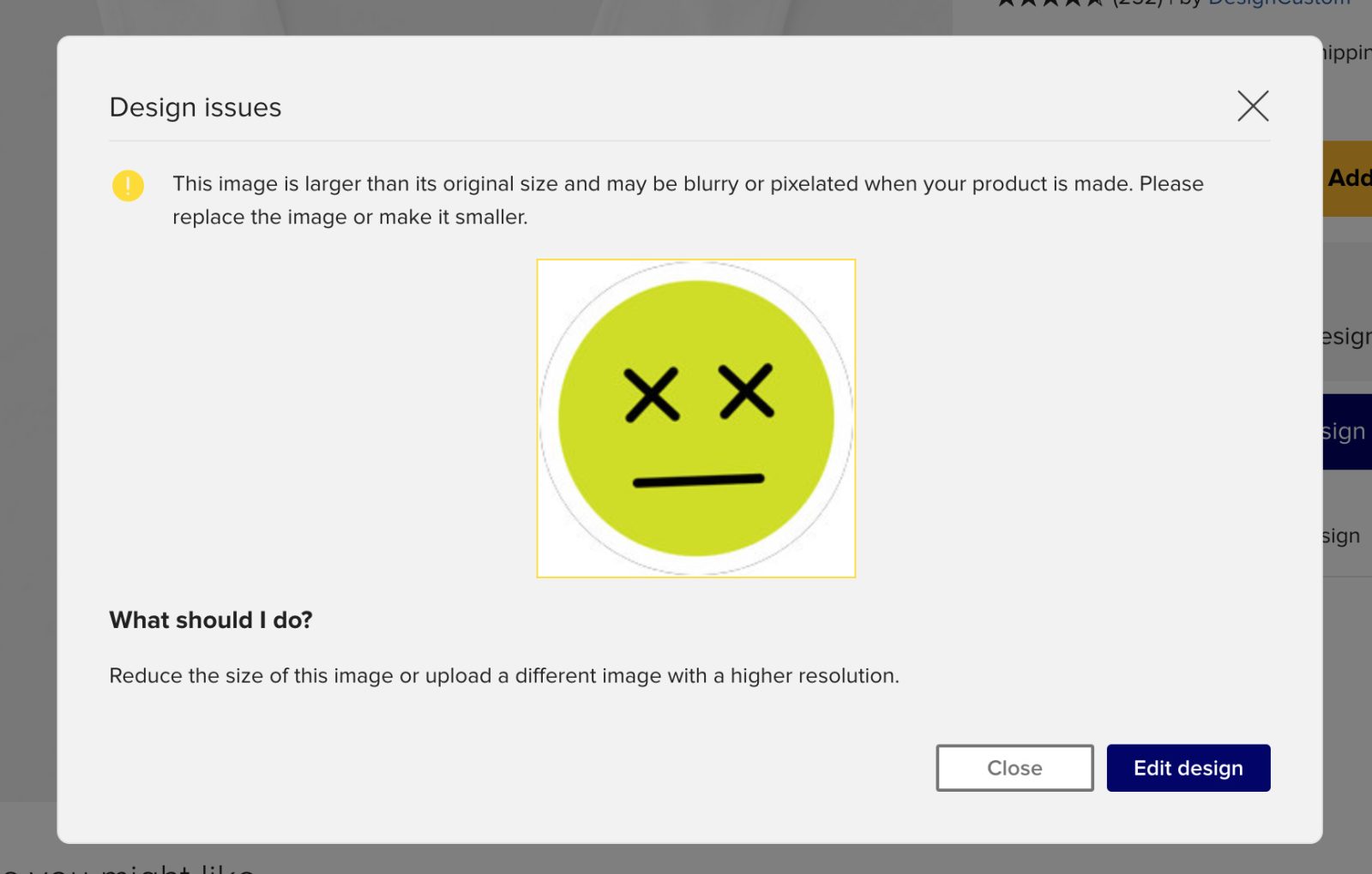
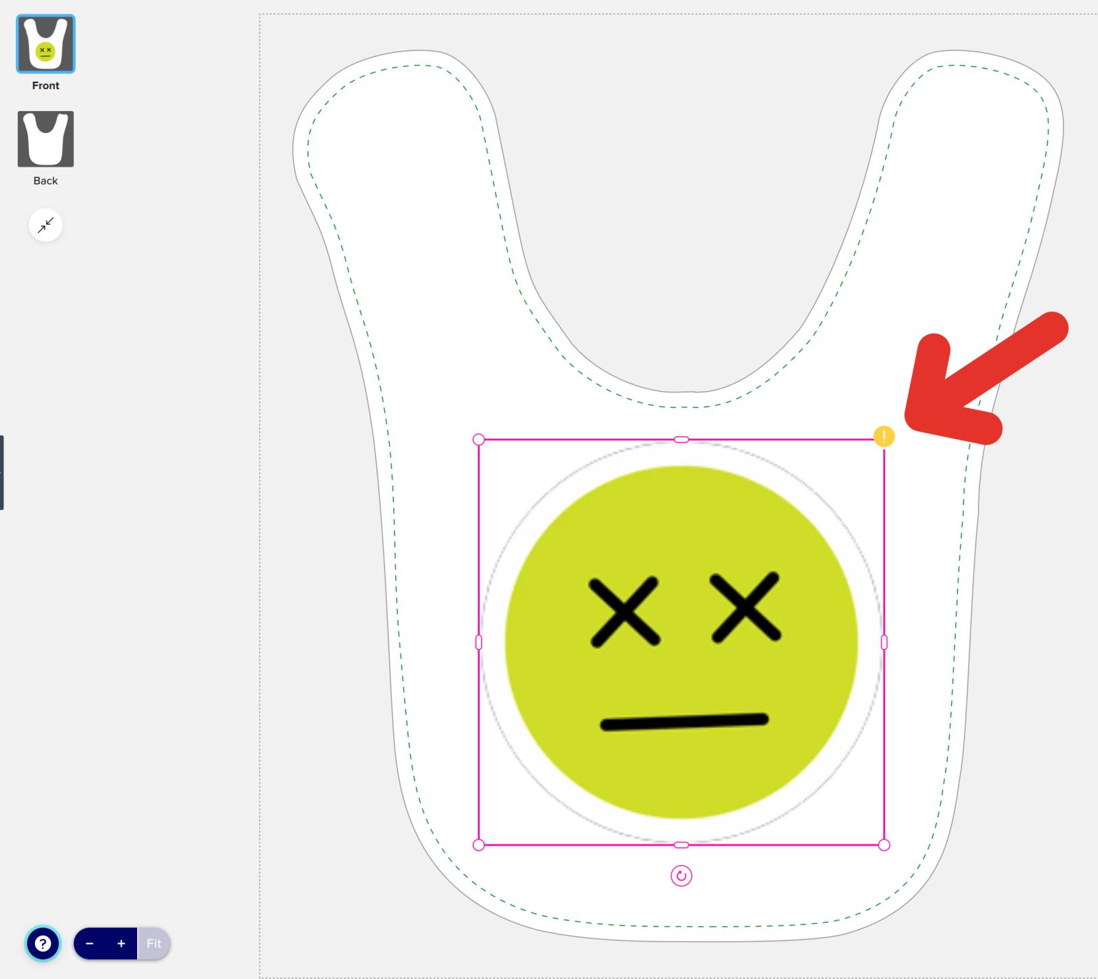
Is my image too small or wrong quality?
Don’t worry!
If your image is too small or too low resolution, you will get a warning message telling you to shrink your image smaller or upload a bigger size image.
You will also see a yellow warning corner on the image causing problems.
Changing the Position of your Image
1. Select your image by clicking on it in the design canvas.
2. Click and drag anywhere in the middle of the image to reposition it on the canvas.
Tips: Alignment guides will help you position it accurately. You can also enable the Grid in the top toolBar.
Additionnally, you can also create different patterns with your image by using the Pattern option on the top ToolBar.
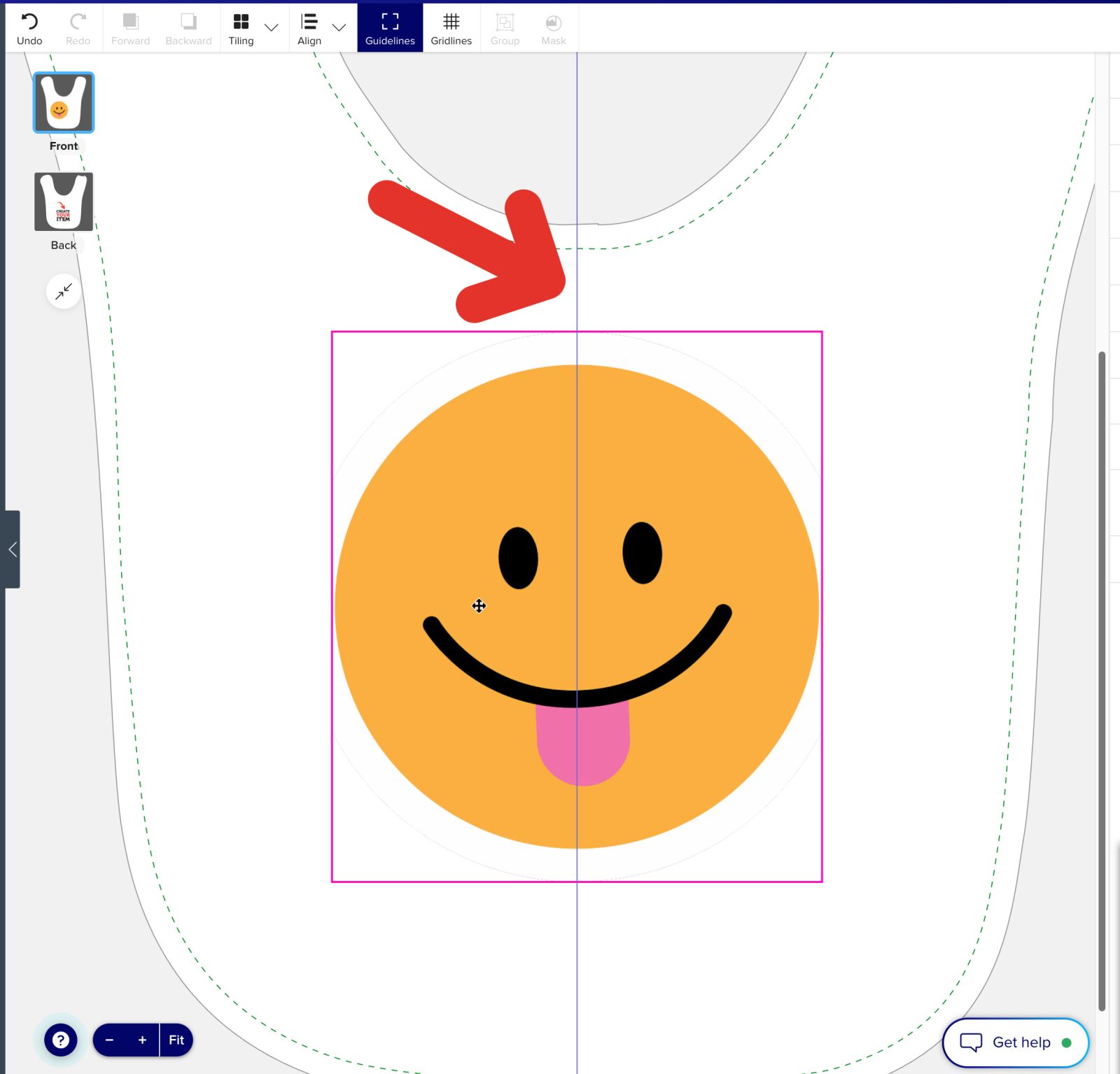
Centering your image:
A blue guide will appear in the middle of the template and will show aligned with the center of your image when the image or text is perfectly centered.
Cropping a Photo
1. Click on your image to select it.
2. Enter crop mode by double-clicking on the image, or click the Crop button in the right properties menu
When in crop mode…
-
- Change the shape of visible area (also called crop window) by clicking and dragging the L-shaped handles on the corners of your image.
- Reposition the visible image in the crop window by clicking anywhere inside the image and dragging it to the desired position.
3. When you are happy with your edits, click anywhere outside the image or click the Crop button to exit crop mode.
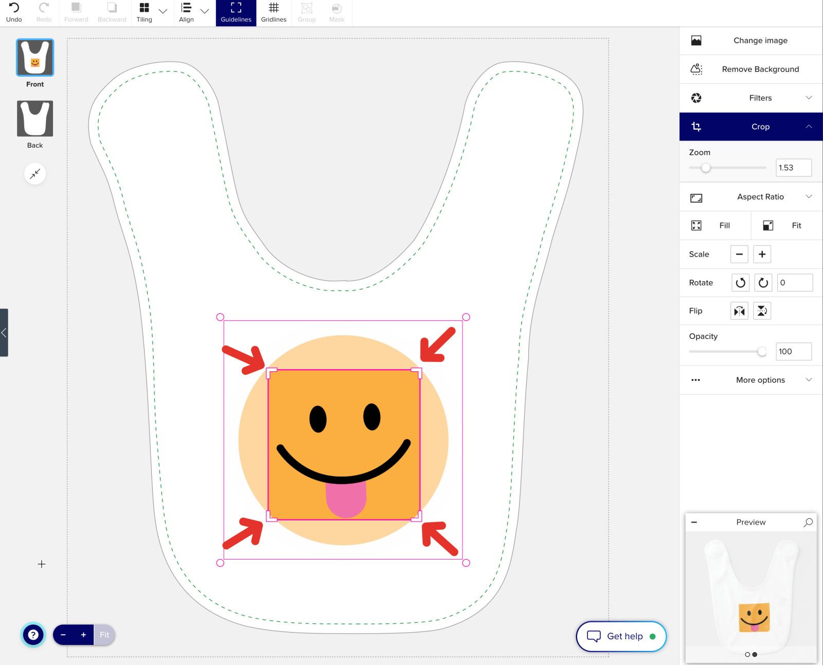
Image Masks
Image masks are a powerful and flexible feature that enables you to manipulate, crop, or conceal specific areas of an image to achieve distinctive visual effects.
With masks, you can tailor your design by fitting an image to a custom shape or highlighting specific details.
Applying a Mask
1. Choose 1 SVG file and at least 1 image together.
The SVG file can be uploaded by you, or choose from pre-made shapes (e.g., circles, rectangles) in the Shapes tab.
For best results, the SVG file should be a plain shape. The color does not matter as it will become invisible and only its shape will be visible.
2. Put the SVG on top of the image you want to transform and have the SVG shape. You can do this by moving each image in the Layer tab on the Right Toolbar.
3. Select the SVG and the image together by clicking on each image while holding SHIFT.
4. In the top toolbar, click the Mask option.
5. To remove the mask, click the Unmask option while it is selected.
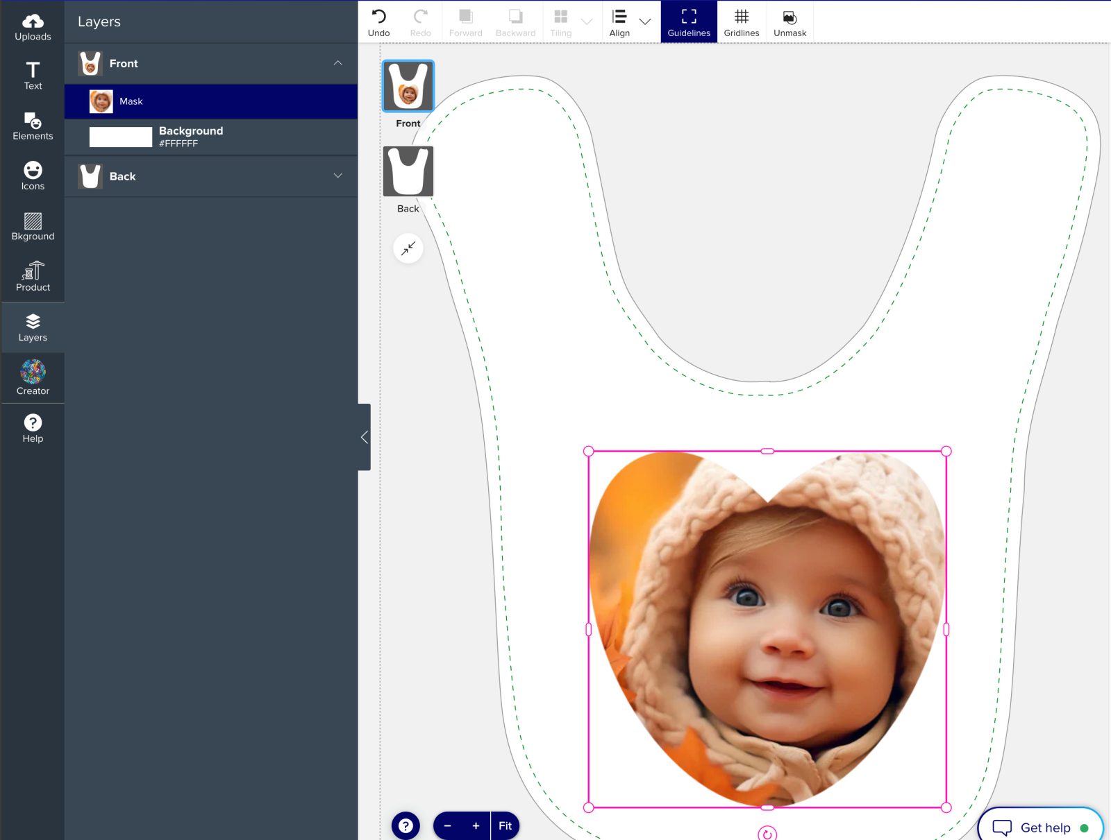
Editing a Mask
1. Select the image mask you would like to edit.
2. Enter Mask Edit mode by double-clicking on the masked image, or click the Edit Mask button in the right propertiesmenu
3. When in Mask Edit mode…
-
- You will see a preview of the masked shape.
- Reposition the visible area by clicking anywhere inside the image and dragging it to the desired position.
4. When you are happy with your edits, click anywhere outside the visible window or click the Edit Mask button to exit crop mode.
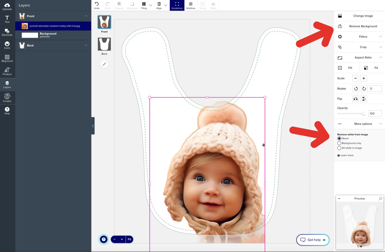
Remove White Backround from Image
The Remove White from Image option allows you to eliminate white backgrounds from your images, creating a transparent effect.
This feature is particularly useful for logos, graphics, or photos with white backgrounds that might disrupt your design’s aesthetic.
Select the image you would like to edit.
1. On the Right Properties Panel, locate the Remove White from Image option under More Options.
2. Select the effect you want to apply-
- Never – This option is the default and does nothing to your image. Use this setting when you want to preserve the original look of the image, including its white background.
- Background Only – This removes only the white areas in the background while leaving white areas within the image content untouched. Ideal for designs where the image has white details you want to keep.
- All White in Image – This removes every white area in the image, including the background and any white within the image itself. Use this for designs where you want complete transparency for a clean and modern look.
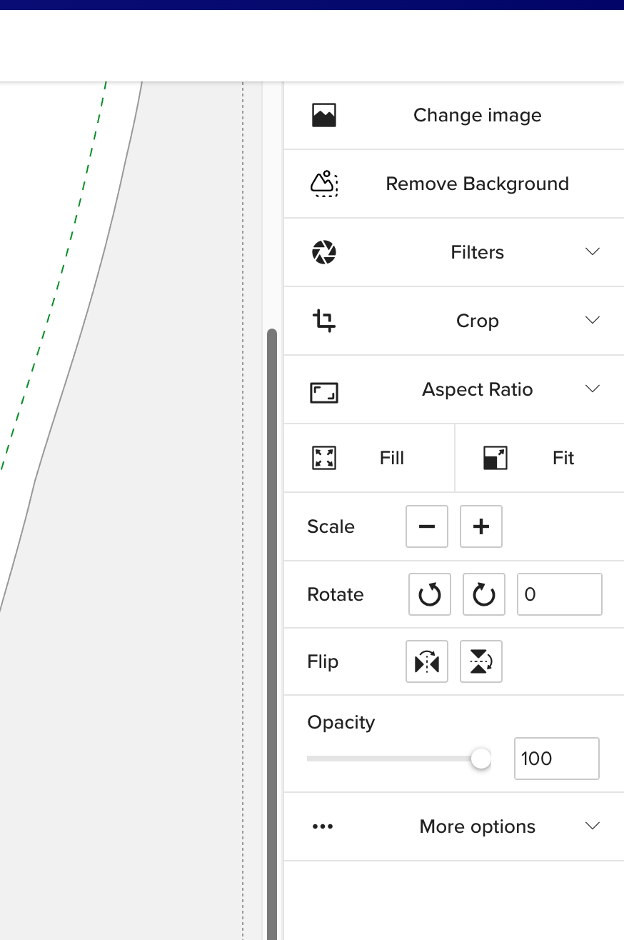
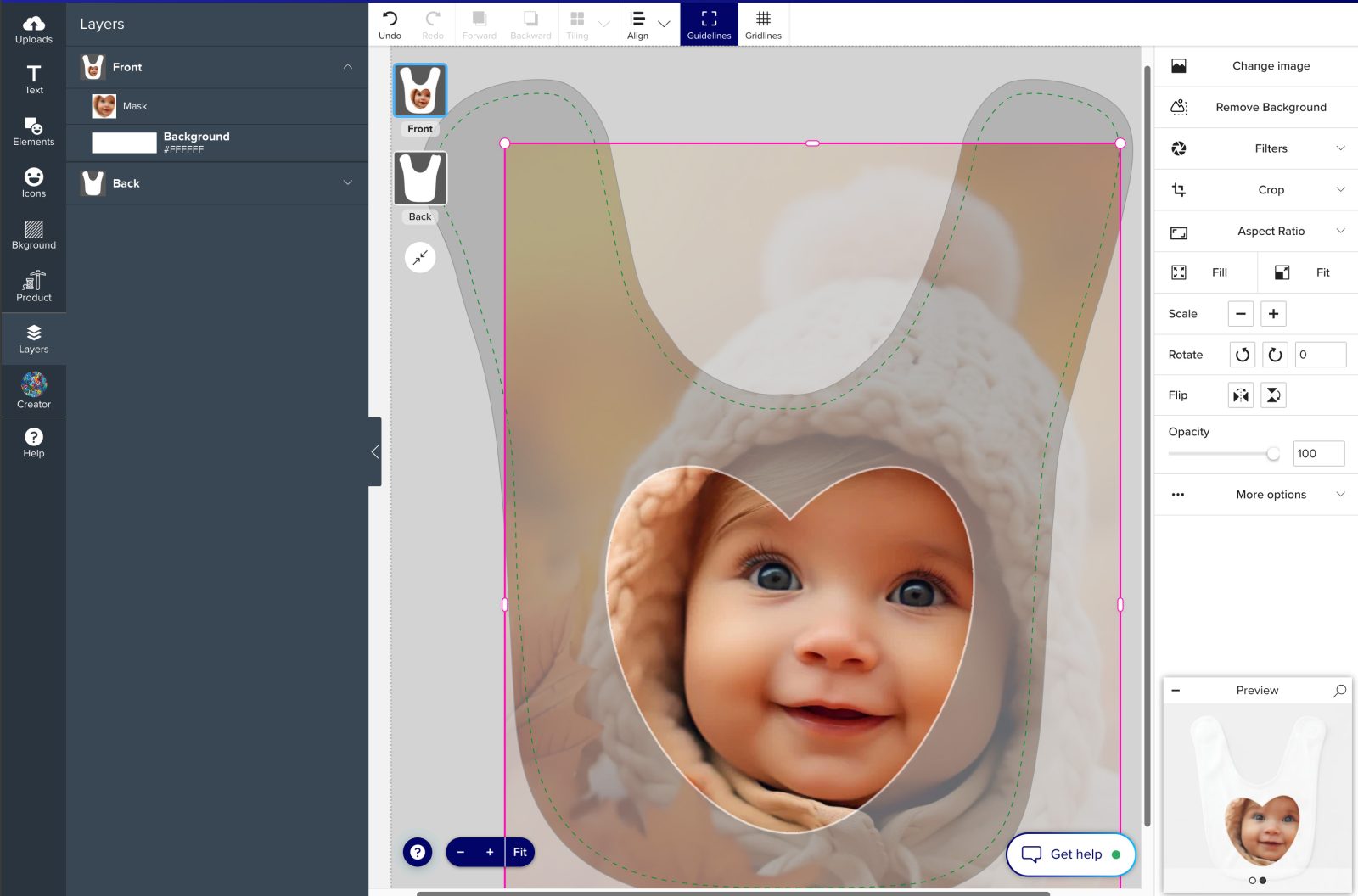
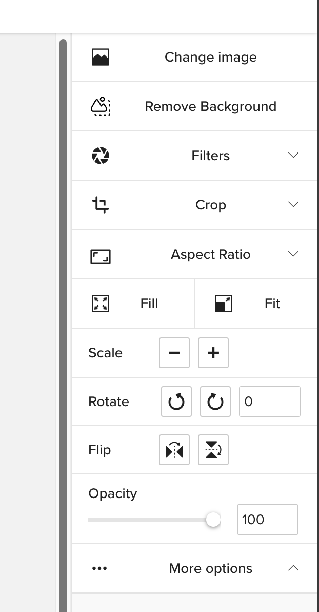
Additional Image Options
When you select an image in the Design Tool, the Right Properties Panel provides a variety of options to customize your image.
Here’s a breakdown of each feature:
Change Image:
Replace the current image with a different one by uploading a new image or selecting one from your uploads.
Filters:
Apply artistic filters to adjust the style of your image, such as black and white or sepia tones.
Aspect Ratio:
Maintain or change the proportion of your image to fit specific dimensions or design requirements.
Fill:
Expand your image to completely fill the selected space or shape while maintaining its proportions.
Fit:
Adjust the image to fit entirely within the design area without cropping.
Scale:
Resize the image by scaling it up or down while maintaining its proportions.
Rotate:
Rotate the image to the desired angle for better alignment or effect.
Flip:
Mirror the image horizontally or vertically for creative layout options.
Adding your own QR Code
Add a QR Code containing any information you want!
1. Click on the ELEMENTS tab on the left Toolbar.
2. Click ADD YOUR QR CODE button located at the bottom of this section.
A window will open and allow you to write whatever information you want (address, name, website, phone number, etc.)
Adding and Editing Texts
You can add all sort of texts with your images or alone. A variety of fonts are available to personalize your text to fit the theme of your design.
Adding Text
1. Click on the TEXT tab in the left Tooolbar.
2. Click on the ADD TEXT button at the top of the left menu.
3. Type your text and click OK.
4. Just like the images, the text box can be resized, rotated, and adjusted manually or using the tool in the Right Toolbar.
Personalising your Text
1. Select the text box you want to customize.
2. Explore the Text Editing menu on the Right Toolbar to change the font style, letter spacing, vertical line spacing, curvature, shadow, opacity, etc.
NOTE:
To use different font style, you need to repeat the ADD TEXT step for each style.
Only one style can be applied to each text box!
Do you need the help of a designer or a custom design?
Contact us!
We offer support and competitive custom design service for personal and professionnal projects!
GET FREE SHIPPING!
Find something you love, create your own design, and select “Start FREE TRIAL” at Checkout to get your FREE SHIPPING!